

go to
AP3.net |
| The Federal Aviation Administration
serves as a model for the world's aviation community. With an audience
of millions of aviators, it sets the standards for the future of
air travel. As Sr. New Media Strategist, I served as the Creative
Director, Lead Designer, Lead Developer and Site Architect on all
of the projects below. |
| |
| 1996-1998 U.S. Federal Aviation Administration
Web Sites |
| Flight2000
- 1997/1998
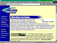
Built from scratch to serve the marketing needs of the
FAA to the U.S. Congress as well as the international aviation
community, this was one of the first websites to have truly
used what is now called Integrated Marketing. From the design
of the website, to presentations, to letterhead, to signage
and trade show media; colors, logos and design architectures
were shared across all media.
|
 |
 |
FreeFlight
- 1997
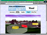
Creating a solid base for the many FAA transformation
efforts that would follow, Free Flight introduced the concept
of more autonomy for pilots to help relieve the over-extended
air traffic management systems. The mandate for the program
website was simple - make the program information available
to the world...through the web. |
| AIT-5
& Software Engineering Process Group (SEPG) - 1997
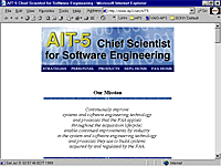
With strict guidelines on purpose, goals and anticipated
usage, this revamping required some real patience. Both
groups resided under the same directorate, so their goals
were the same: presenting an organized listing of white
papers, newsletters, studies and contact information. The
first step was to reform their newsletter publishing process
- where an entire community of Unix and Mac users were unable
to view the MS Word format posted.
|
 |
 |
ASD
- 1996/1997
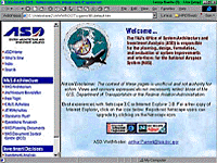
With a mandate to refresh all design elements and navigation
while maintaining all existing content, this was quite labor
intensive – at an age before content management systems
(CMS) were even conceptualized. In order to meet the agressive
deadlines for the website redesign, I engineered a templating
system akin to the most basic of modern CMS and married
it to a navigation system that utilized JavaScript mouseovers...which
weren't even supported by browsers at the time. Six months
later, as the browsers caught up to technology, users noticed
that enhanced usability achieved through mouseover elements...which
integrated seemlessly. Already embedded in the codebase,
the JavaScript required no modification once browsers began
supporting the standard. In addition, the division Newsletter
was redesigned for better readability and to share design
elements with the website...then was posted for web accessibility
in Adobe PDF format. |
| |
|
|
|
|
|